How to design an excellent scientific poster
‘Science is not finished until it is communicated’, so said Sir Mark Walport, former medical scientist and Chief Executive of the UK Research and Innovation (UKRI).
Unsurprisingly, being in the Communications and Engagement team, we agree with Sir Mark, and there are a number of ways that science can and is communicated. We can do press releases, use social media and organise outreach events, we have meetings, write reports and labour over publishing peer-reviewed papers.
Another vital method for peer-to-peer communication is at scientific conferences. Hordes of scientists from a particular field, come together to showcase their latest research and to learn about the work of their peers, collaborators or competitors.
Alongside the oral presentations, or talks, a key way to communicate the latest research and results is through ‘poster sessions’. Here scientists, of all levels in their careers, present their latest discovery on a sheet paper or fabric, pinned to a board.
Poster sessions provide an ideal opportunity for peer-to-peer learning and should be an excellent experience for presenter and viewer.
As a presenter, this is a captive audience. There are large numbers of people who are interested in your field of research and they are all there to learn. They want to get their fill of new methods, exciting initial results and network with like-minded people from all over the world.
But in reality, poster sessions aren’t as useful or enjoyable as they should be. Why is that?
There is a burgeoning grass roots initiative led by Psychology PhD student Mike Morrison, that believes that one of the reasons for this is that the posters on display at these sessions aren’t designed in the optimal way for the environment and context they’re used in. In other words, the audience posters are created for aren’t given the information contained within them, in a way that allows them to access it.
User-centred design is the process of considering how an object will, or needs to be, used and designing it accordingly. For example, think of a door which can only open in one direction. From one side the door needs to be pulled and from the other pushed. Effective user design of that door, would mean that on the pull side of the door there is a handle, allowing the user to pull open the door and on the other side, no handle but a flat plate.
A pull handle works perfectly on the side of the door which needs to be pulled but hinders the user on the push side. The handle implies that the user should pull the door, potentially walking into it, before realising it doesn’t open in that direction and then pushing the door.
Why? Because a handle suggests to the user that door needs to be pulled and thus influences the user’s behaviour. Wasted time and potential (minor) injury, all because of poor user design.
The same principles of considering how something will be used and then designing accordingly can be used for anything from doors to websites. It is here that Mike’s push to apply these principles to scientific posters comes in and his video (above) is well worth investing 20 minutes of your time.
When Mike, was first asked to make a scientific poster he thought the reason most academic posters look the way they do is because they have to. However, he soon learned that there were no rules for academic poster design enshrined into academic lore and realised there was a huge opportunity to improve the way research is communicated.
So, what can we do?
The first thing is to change the way posters are designed and put together, making them quicker and easier to create, which is great for the presenter.
We can also make them better at conveying the key information, by considering what the purpose of the poster is; i.e. what is it trying to tell people?
An ideal academic poster should accomplish three goals;
- Maximise the amount of insight transferred to attendees of the poster session
- Keep the good stuff; viewers still need detail and they need to encourage conversation
- We need to achieve 1 and 2, in a way that is as easy and quick as making a poster within the current conventions, otherwise it won’t happen.
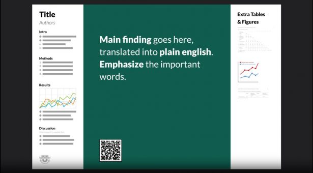
To do this, consider a completely blank page and think; “if I could only put one thing on here, what would it be?” The answer is probably, the main finding of the study, because what you found is the most interesting and most relevant thing you want to tell people.
So, you need a finding, or take-home message, to be placed prominently in the front-and-centre, where it is easy to read and cannot be missed. The next step is to take that finding, and without changing the meaning, word it in such a way that it is both easy to understand and memorable.
For example, Mike found the following finding hidden away in the ‘Discussion’ section of one poster, which he then changed into Plain English;
- “We found consistent differential validity for some non-cognitive measures for predicting international student GPA, specifically with SJT, Continuous Learning, Social Responsibility and Perseverance”
To;
- “For international students, perseverance and a sense of social responsibility are extra important for predicting first-year GPA”
Instantly making the key piece of information easier to digest and remember.
A good way to do this is to think of billboards which are designed to transmit information to people passing by them. As such, they provide a good starting point for scientific posters, which are essentially trying to do the same thing. Only our posters are ‘selling’ the research findings/methods/techniques, rather than a product.
However, while that is the key take home message, a good academic poster needs to do more than just announce the headline, because behind every headline is the story.
For that, Mike suggests a bar on the side of the poster on which you will normally stand, called an ‘ammo box’, which features all the data (tables, graphs etc) that back up the headline and which you would refer to, in order to answer any questions that arise from people who talk to you about your poster.
On the other side of the page, Mike suggests another bar, named ‘the silent presenter’ in which you add the sections that appear on almost all scientific posters, but slimmed down and formatted in a way to be easily consumed; i.e. in bullet points. It is in this bar that you would add; the question you started with, your collaborators, an introduction, the methods, results and discussions. This space can be used to provide people an overview of the study, assuming they will be reading it silently, in three or four minutes, rather than 10.
The side bars are a key part of the proposed new template, because they allow you to include all the information which appeared on the old design but arranged in a way that is optimised according to how they are used.
With the design simplified, there is room to provide a source for the full study for people who are intrigued by your headline and would like to know more, but don’t have time to talk or read your ‘silent presenter’ bar.
In a digital age, 99% of conference attendees will have a smart phone, which can read QR codes. A QR code is easy to create and can be added to a poster so that anyone can photograph it and find the full study, or further information online, quickly, easily and without needing to interact with you at all. Using QR codes allows you to include even more information than a traditional poster allowed for, but in a format that saves time, cognitive effort and in much less space.
All of this taken together allows each person who sees your poster to take exactly the level of information away from it they want, from just the headline finding, through to digesting the full research paper.
Finally, another good tip we were given on our facebook account by Katia Hougaard is to include a stack of business cards with your poster, so that people could take your contact information with them and contact you later.
By following Mike’s advice, together we can design better scientific posters and improve the rate of scientific progress.
This is not to say that you have to use the layout Mike suggests, but we recommend trying to create a poster that teaches attendees something as they walk by, instead of relying on them to stop and talk to you, in order to learn about your work. As Mike notes in his updated video (below), if the first thing somebody says to you is “So, tell me about your poster”, it’s because they have learned nothing from it.